How Do I Modernize My Website? Part 3 of 5: Mobile Website Design

This post is third in a series of five about website modernization.  You’ll want to check out the first two here:

How Do I Modernize My Website? Part 1 of 5: Website Photos

How Do I Modernize My Website? Part 2 of 5: Basic Website Structure

All of the blogs in this series are important, but adjusting your site to function well on mobile devices is something you should have done yesterday.  Don’t waste time thinking about the problem- contact us now to fix it!

The Case for Mobile Website Design

Mobile phone usage is reshaping the way we consume information.  Smartphones today are to computers what computers were to books in the mid 90s.  There are currently about 3 billion internet users worldwide, and in some countries, a smartphone is the only affordable way to access it.  If your website is not mobile friendly, you’re already antiquated and should either give up, or make the shift immediately.  Your competition has likely already made the shift to proper mobile website design, and visitors to your site using mobile devices are leaving it in droves.

We hear a lot of business owners say, “We sell only to other companies.  We don’t need a better website because people aren’t buying from us based on our website.”  That logic is self-defeating, and quite frankly, these business owners must live in a dark cave.  A great article written by Lauren Kaye at Brafton Inc. more than two years ago suggests that 84.3% of B2B companies (businesses selling primarily to other businesses) were researching company websites before making a purchase.  That was two years ago!

Full Page Websites Aren’t Enough

If you think you don’t need a mobile friendly website, you obviously aren’t measuring your search traffic and- NEWS ALERT! – you can’t improve what you don’t measure.

According to Statista, smartphone market penetration in the US reached 58.9 percent in 2015

Device Atlas suggests that there are over 2.6 billion smartphone users worldwide

The most important stat to consider when making the decision about a mobile version of your website is shared by Greg Sterling (love the last name), contributing Editor at Search Engine Land.  According to Mr. Sterling, about 56% of traffic to top US sites is coming from mobile devices.  That’s right.  More than half of all website searches are performed using mobile devices.  If this information alone isn’t enough to change your mind, please go back into your cave.

People expect a great website experience when using large desktop computers, laptops, tablets and smartphones.  They’re looking for something that’s properly formatted no matter the device they happen to be using.

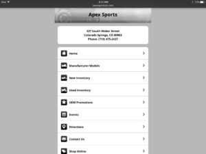
There are many ways to build what’s been coined a “mobile friendly” website.  The technical details can be daunting, so we will share visual representations.  You’ll get the gist.

The five most common problems we see with mobile versions of websites:

Mobile website design

1) Tiny on a smartphone

This is the biggie: websites meant only for full size computer screens.  They appear tiny on smartphones.  These websites require that you zoom in and out by pinching or stretching two fingers simultaneously.  It means no effort was ever put toward making the website mobile friendly.

Website too big on smartphone

2) Huge on a smartphone

Some websites are too big on a smartphone and you have to swipe all around the screen to move the website into a position that will somehow work.  The page typically cannot be sized by pinching or stretching with your fingers.  It’s massive and unwieldy.  Again, the developer never tried to offer a better mobile experience.

Mobile website with big buttons

3) Just buttons that are ugly

Many mobile versions of websites are literally just buttons.  Nothing branded, no images, nothing even slightly interesting.  Essentially, the company has two different websites; one for larger screens and the mobile version for all other screen sizes.

Tablet website with big buttons

4) Giant buttons that are ugly on tablets- Having a mobile version of a website that’s all about buttons poses yet another problem.  When using a tablet, all you see is a bunch of giant buttons formatted for phones.  Sometimes they’re designed to span the entire width of the page.  It’s really ugly and obviously not well thought out.

5) A separate mobile site- Many mobile websites use a second domain that’s separate from their full size counterparts (e.g.: www.abccompany.com vs. m.abccompany.com).  Instead of driving all traffic to a single website, all work is doubled to maintain two completely different versions of a website.

Responsive Design is Best for All Devices

Responsive design ensures your website- and only one version of it– will automatically change and adapt to all devices.  During the development process, certain elements can be configured to collapse, hide, be turned off or react differently based on the screen size of the device accessing the site.

In the examples below, you’ll notice that we’ve tweaked some things based on what type of device people are searching from.  Why?  Because mobile networks tend to be slower and using them means it takes longer to load things like videos and animations.

One cool thing to note is the parallax effect.  When moving the cursor on a full size screen, the coffee background image shifts side-to-side.  This translates well to mobile devices because the same gyroscope or accelerometer (think about those games where you navigate a BB through a maze) that determines screen orientation also moves the image side-to-side on a tablet or smartphone.

When accessing our website from a full size laptop screen, the site includes:

  • A video right up front that automatically plays
  • Several animations where elements of the page move or fade in from the sides or the bottom as you scroll
  • Hovering animations that react to a hovering cursor

Accessing the website from a tablet is a bit different:

  • The video is turned off, but the words over the top of the video still appear
  • All of the more intense animations are turned off, but the animation of the client sites section at the bottom stays in tact because it’s subtle and occurs very quickly

When viewing the website from a smartphone there’s one major difference:

  • The video at the top is replaced altogether with an image that fits the space better and loads much faster


Remember, this one website was configured to function different ways depending on the device accessing it.  If your site struggles in any of these areas, what are you waiting for?  Contact us now at 719-377-2120 or questions@modernizemysite.net.

Leave a Reply

Your email address will not be published. Required fields are marked *

Fill out this field
Fill out this field
Please enter a valid email address.

Menu